Here’s a really easy way to get better results:
Add arrows to your action pages.
That’s it. Simple eh?
An action page is when you want a prospect to do something – like sign up or buy.
It’s one of the few things I’ve never seen fail – it’ll always give your results a little bump.
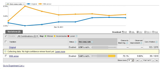
Here’s a screenshot from a client’s split test. The test is a page with an arrow, against the the same page without an arrow.
The orange line (the page with the arrow) is beating the control (the page without the arrow) by 9.8% at the moment.
So call it a 10% bump – from just a tiny little arrow.
So now they are converting at 5.44% which is not too shabby – but there’s still room for improvement (conversions were at 1.99% when we started working with them).
But back on to arrows.
I’ve always found hand drawn arrows work best.
And of course, the best place to put a ‘call to action’ like a sign up is above the fold, so people don’t have to scroll to see it.
Top left is the most looked at place of your site. Heatmaps prove this time after time.
So imagine, you’re trying to launch a new social network.
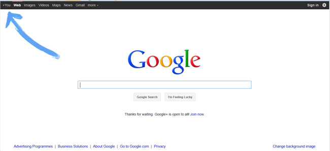
Ideally you want a hand drawn arrow, pointing towards the top left of the page, right?
There are only a few companies smart enough to do that.


 Click here for 3 fool proof ways to